Internal Tool · Product Strategy · System Design
Page Builder
Role
Product Designer + Front-End Engineer
Scope
Strategy · UX · System Design · Dev
Platform
PSAI Internal Admin
Status
Live — adopted company-wide
Problem
Every text change required a designer and a developer.
PSAI's old platform couldn't dynamically edit pages. Every client landing page was built statically by hand. That meant a typo fix, a swapped image, a color tweak — anything — had to route through a designer and a developer to ship.
Build times for a new client site averaged 90 days. The team was a bottleneck. Clients waited weeks for changes that should take minutes. Internal velocity capped at how fast the design and dev teams could ship.
We needed a way for clients to own their own sites without losing the quality, consistency, and lead-generation performance the platform was known for.
Before
90-day average site build. Every change — text, image, color — routed through design and dev. 5 client sites shipped per month, maximum.
The constraint
Clients are home remodelers — not designers, not developers. Any solution had to work for someone who's never opened a CMS in their life.
Research
Drag-and-drop was the obvious answer. The interviews said no.
The internal default assumption was a drag-and-drop builder — that's what every modern builder ships with, and it's what the team kept reaching for in early conversations.
I ran internal interviews with the design and account teams, then client interviews with active users. The signal was consistent: clients didn't want to design pages. They wanted to change three things — text, images, and colors. That was 90% of every change request the support team had ever fielded.
A drag-and-drop builder would have given them power they didn't ask for and complexity they couldn't navigate. PSAI's clients are home remodelers — a vertical with specific buying patterns, conversion expectations, and content needs. Most weren't comfortable with web tooling at all. Putting a Figma-style canvas in front of them would have driven them straight back to calling the support team.
That research killed the drag-and-drop direction.
What clients asked for
Text changes, image swaps, color tweaks. 90% of every support request fell into those three buckets.
What drag-and-drop would have given them
Full layout control, component libraries, responsive breakpoint editing. Power they didn't want and couldn't navigate.
The insight
The right tool wasn't the most powerful one. It was the one that matched what they actually needed to do — nothing more.
Process — Research to Architecture
FigJam working doc — interview insights → architecture decision
"I just want to change the text and swap photos"
Client interview
"90% of support tickets: text, image, color changes"
Account team
"Drag-and-drop scared them — they'd call support instead"
Internal interview
What clients actually need
Text edits · Image swaps · Color changes · That's it.
✕ Kill drag-and-drop
Power they didn't ask for. Complexity they couldn't navigate. Wrong tool for this vertical.
Section-based architecture
Pre-built sections. Opinionated layouts. Scoped to home remodeling. Clients assemble, not design.
Theme layer underneath
Colors, fonts, button styles defined once. Every section inherits. Brand stays consistent.
Decision
Borrow from Shopify. Pre-built sections. Opinionated layouts. Built for one vertical.
I pitched a section-based architecture modeled on Shopify's theme system. Pre-built section types — services, gallery, testimonials, hero, contact — each with multiple layout variants already validated for lead-generation performance and client approval rates.
Every section type and every layout was scoped specifically to the home remodeler vertical. We weren't building a general-purpose page builder. We were building a builder that knew what a remodeling business needed to show, in what order, with what calls to action. The intent behind every section was industry-specific.
Clients couldn't break the page. They could only assemble it.
In edit state, a client could:
Reorder sections
Choose a layout per section
Swap images
Edit text
Adjust colors within brand constraints
Nothing else was exposed. The constraints — and the vertical specificity — were the feature.
Solution
A page builder alone wasn't enough. We needed a theme system.
A page builder without a theme layer would have meant brand drift the moment a client started editing. So I scoped a theme builder underneath the page builder.
The theme builder gave control over brand colors, button shapes, font families, and component variants. Clients could customize a theme to match their brand identity, then every page they built inherited those tokens automatically. Edit a button radius once at the theme level — every section across every page updates.
This shifted the work from "build a page" to "build a system that builds pages." The page builder became a consumer of the theme system, not a standalone tool.
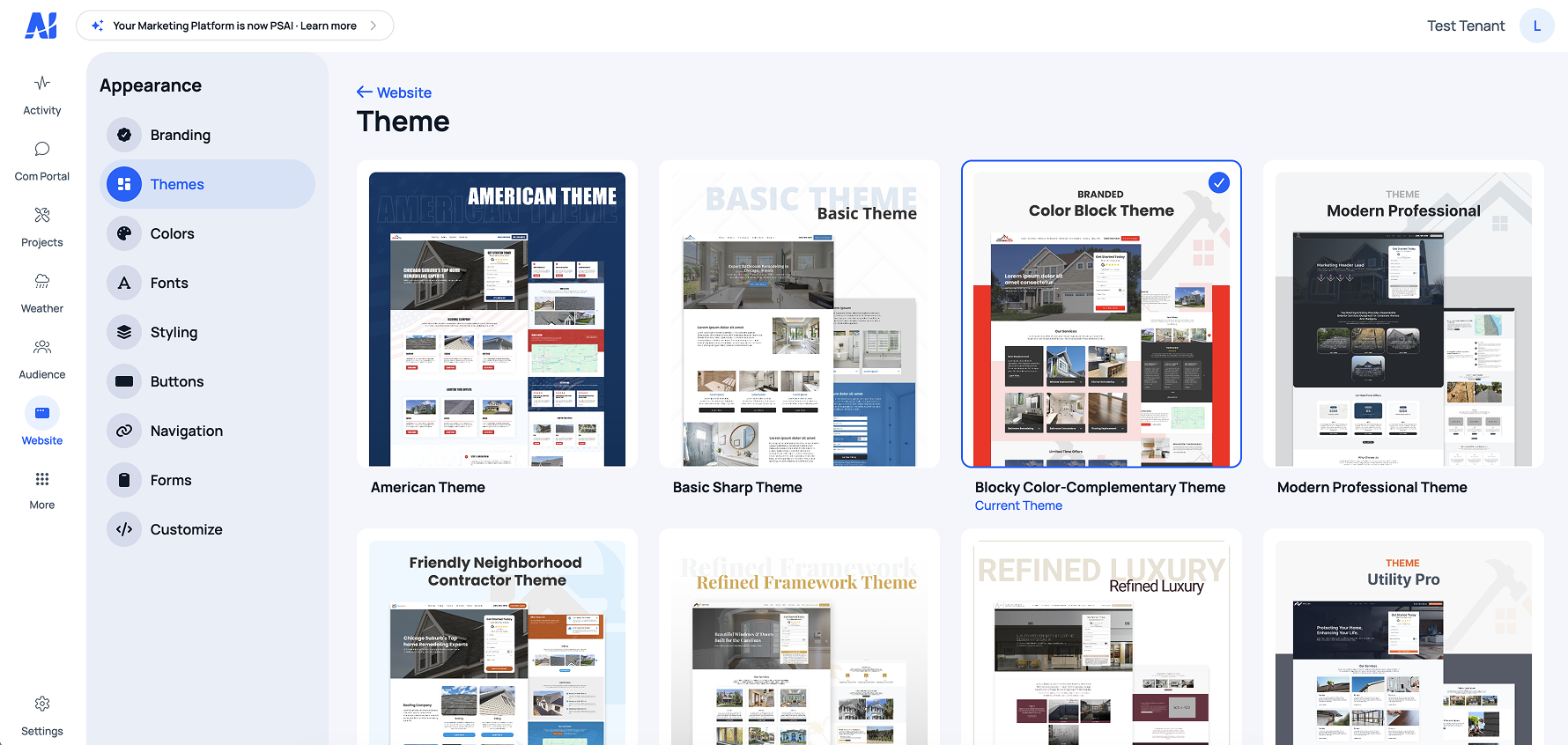
Theme controls — colors, type, button styles, component variants
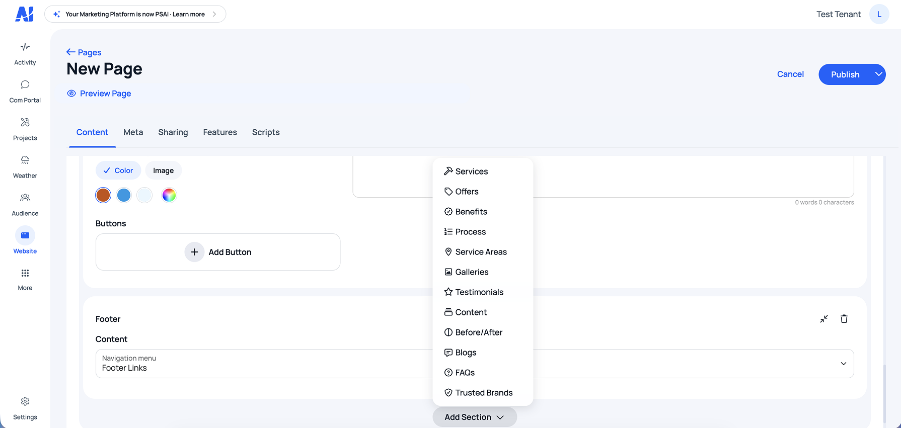
Section library — pre-built for the home remodeling vertical
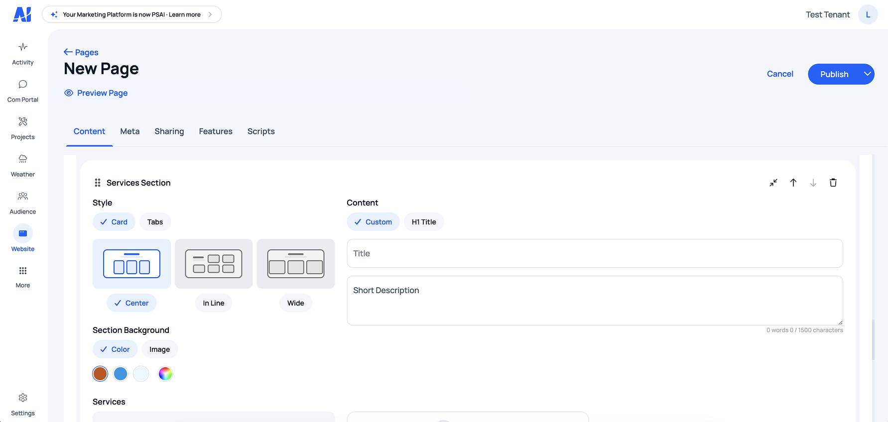
Layout variants — 2–3 per section type, all conversion-optimized
UX Design
The hardest UX problem wasn't the builder. It was the user.
Home remodelers don't think in design terms. They don't know what a hero section is, what a CTA does, or why typography matters for conversion. Every UX decision in the builder had to assume that.
The builder had to feel like editing a slide, not configuring software. And every choice it offered had to make sense for a remodeling business specifically — not a generic small business, not a SaaS company, not a restaurant.
Plain language
"Show your services" not "Services Module". Section names tied directly to how clients think about their business.
Image-led previews
Layout selection used visual thumbnails, not labels. Clients pick what looks right — they don't read option names.
In-context editing
Edits happened in the preview, not in a side panel. What you see is what you get, always.
Preview as default
The builder opened in preview mode. Edit mode was a deliberate action. Clients felt safe.
Curated section types
Only sections relevant to remodeling businesses. No irrelevant options polluting the choice architecture.
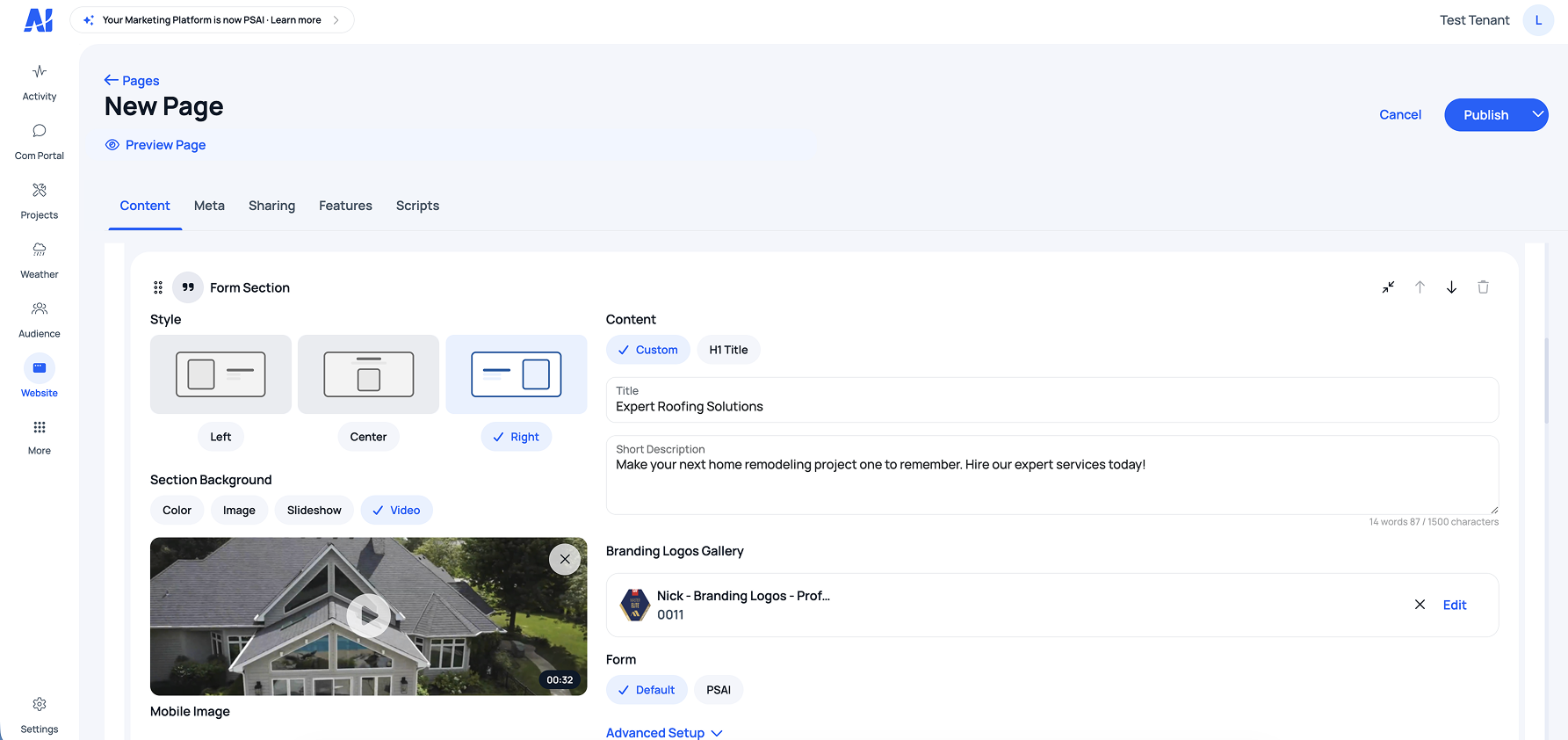
Edit state — changes happen in the preview, not in a panel
Iteration
Shipped small. Added every sprint.
The first version was deliberately minimal — three section types, two layouts each, basic theme controls. We shipped, watched real clients use it, and added features every sprint based on what they actually asked for.
Each sprint was scoped with PM input on capacity and priority. Backend engineers built the data layer and API for each new section type while I handled design and front-end implementation in parallel. Account managers surfaced client requests that shaped the roadmap.
Over time the builder grew to support custom client requests, more efficient page-building flows, and edge cases the original scope didn't anticipate. Each addition was driven by real usage, not assumed need.
This iteration cadence was the difference between a builder clients tolerated and a builder they adopted.
V1 scope
3 section types. 2 layouts each. Basic theme controls: color, font, button style. Enough to ship a real site.
How it grew
Every sprint added based on real client requests. Custom section support, gallery variants, testimonial formats, edge cases from actual usage — not assumptions.
Outcome
90 days to 2 days. From 5 sites a month to 20 in 60 days.
45×
Reduction in site build time — from 90 days average to 2 days
20
Client sites launched in the first 60 days after builder launch — up from 5/month
0
Designer or developer hours required for client site builds after rollout
Downstream effect
Designer and developer time freed up for higher-leverage product work.
Downstream effect
Faster client onboarding meant lower time-to-value across the platform.
Downstream effect
Early signal on reduced churn — clients who built their own sites showed higher platform engagement.
Reflection
The constraint was the product.
The biggest design decision on this project wasn't a UI pattern — it was killing the drag-and-drop direction. That took convincing. Drag-and-drop felt powerful. It felt like the right answer. It wasn't.
Trusting what the interviews said over what felt intuitive — and then designing constraints deliberately instead of apologizing for them — is what made this product usable. The narrowness was the feature.
The Shopify model was the right reference. Not because it's a popular product, but because it solved the same underlying problem: give non-designers control over a system without letting them break it.
What I'd do differently
Validate section types with real clients before building each one. Some early sections were built on internal assumptions and got rebuilt within two sprints. A faster validation loop on each section type would have saved engineering cycles.
What worked
Killing the drag-and-drop direction early. The interviews told us what clients actually needed, and trusting that signal — instead of building what felt powerful — is what made the builder usable for non-technical users. The constraint was the product.