Enterprise SaaS · Product UX · Design Systems
Admin UX Overhaul
Role
Head of Design + Front-End Engineer
Scope
UX Audit · Design System · Admin UI
Platforms
Spectrum CMS + PSAI Admin
Status
Live — both platforms
Problem
Two admin platforms. Neither looked like a product.
Spectrum CMS — used to manage enterprise websites, SEO, and content — was aging. Inconsistent spacing, legacy table styles, no clear visual hierarchy. It worked, but it fought you.
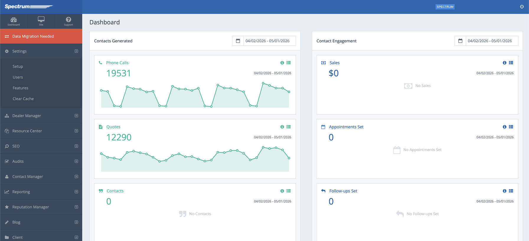
PSAI Admin — the lead generation dashboard — was effectively a dev tool dressed as software. Raw Bootstrap, no empty states, no loading patterns, no UX intent. It had been built by engineers to get data on screen, not to be used daily by a non-technical team.
Internal teams were spending real time switching mental models between the two. Same company, same data — completely different muscle memory for every interaction.
Spectrum CMS — outdated, inconsistent patterns
PSAI Admin — dev tool aesthetic, no UX intent
Audit
Start with what's actually broken.
Before touching UI, I audited both platforms side by side — documenting every pattern mismatch. The goal wasn't to catalog every pixel problem. It was to find the structural divergences that caused the most daily friction.
Navigation
Spectrum used a top nav. PSAI Admin used a sidebar. Same user, same session, two different mental models for getting around.
Typography
Each platform had its own heading scale. H1 in Spectrum meant something different than H1 in PSAI Admin — same tag, different visual weight.
Data tables
Row heights, column padding, hover states, pagination — all different. Recognizing patterns in your data should feel automatic. It didn't.
Forms + inputs
Field heights, label placement, validation styles, error states — none of it matched. Filing anything in one platform didn't prepare you for the other.
Color system
Two different shades of blue called 'primary.' Neutral palettes with different gray scales. No shared token system, no contract between them.
Empty + loading states
PSAI Admin had neither. Spectrum had inconsistent versions. Users couldn't tell if the system was working, broken, or waiting on them.
Process — Audit Findings
FigJam working doc — audit → standardization decisions
Navigation
Spectrum: top nav. PSAI: sidebar. Same user, two mental models.
→ Standardize on sidebar across both platforms
Typography
H1 meant different visual weight in each platform. No shared scale.
→ Unified heading scale — same sizes, weights, line heights everywhere
Data Tables
Row heights, padding, hover, pagination — all different.
→ Define once: row height, column padding, hover state, pagination pattern
Forms + Inputs
Field heights, label placement, error states — none matched.
→ Single anatomy: 40px fields, label above, error below
Color System
Two 'primary' blues. Different gray scales. No shared tokens.
→ PSAI brand blue as system primary. One neutral palette, shared tokens
Empty + Loading States
PSAI Admin had neither. Spectrum had inconsistent versions.
→ Add consistent empty and loading patterns to PSAI Admin
Constraints
Live software. No clean slate.
Both platforms were live, actively used by clients and internal teams. A full rebuild wasn't on the table — this was a reskin and unification of existing software, not a greenfield product.
That constraint shaped everything. I couldn't refactor navigation architecturally — I had to work within the existing routing structures. I couldn't swap out the form library — I had to restyle what was there.
The engineering teams on each platform had different stacks and different bandwidth. Changes had to be scoped to what could actually ship in the same window as the brand rollout.
I worked directly with both engineering teams to scope what was achievable — reviewing each proposed change against their sprint capacity and technical debt. Some design decisions were adjusted based on their input about what could ship cleanly versus what would introduce risk.
What this ruled out
A unified navigation architecture. A shared component library built from scratch. Consistent interaction patterns at the motion/animation level. Anything requiring a coordinated multi-sprint engineering effort.
What this forced
Ruthless prioritization. Focus on the visual layer — color, type, spacing, component styles — where reskinning could produce the most coherence for the least engineering lift.
Design Decisions
Pick one pattern. Apply it everywhere.
With constraints defined, the design work was about standardization decisions — not invention. For every divergent pattern, I picked one version, documented why, and applied it across both platforms.
One primary blue
Picked the PSAI brand blue as the system primary. Spectrum's legacy blue was retired. One color, one meaning, across both products.
Unified type scale
Established a shared heading scale — same sizes, same weights, same line heights in both platforms. Visual hierarchy finally meant the same thing everywhere.
Table standards
Defined row height, column padding, hover state, and pagination pattern once. Applied to every data table across both platforms.
Form anatomy
Single field height (40px), label above the field, error state below. Consistent across every form in both platforms.
Neutral palette
One gray scale shared across both products. Background, border, muted text — same tokens, same values, no more divergence.
Empty states
Added consistent empty and loading state patterns to PSAI Admin. Basic, but it made the product feel alive and trustworthy.
Solution
One product experience. Two platforms.
The after state isn't a redesign — it's a unification. The same color system, the same type scale, the same component patterns applied consistently across both platforms. A user moving between Spectrum CMS and PSAI Admin for the first time after the rollout should feel like they never left the same product.
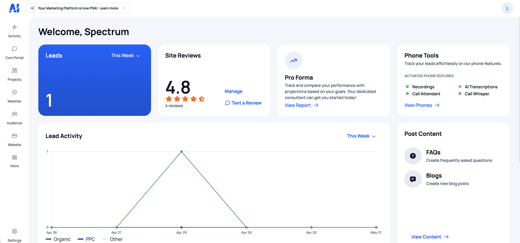
After — one coherent product experience across both platforms
Outcome
Shipped alongside the rebrand. Adopted immediately.
2
Live admin platforms unified under a single design language, shipped simultaneously
0
Rebuilds required — full unification achieved through reskinning and design standardization
Both
Internal teams and clients responded positively to the coherence of the new experience
Reflection
Constraints make the design decisions for you — if you let them.
The hardest part of this project wasn't the design work — it was accepting what the constraints ruled out. No unified nav. No shared component library built from scratch. No interaction consistency at the animation level.
Letting go of the ideal solution and committing fully to the achievable one produced better results than trying to sneak in scope. The reskin shipped on time, alongside the brand rollout, and it held up.
A design system built before this work would have changed everything. Not just for this project — for every product decision that came after it.
What I'd do differently
Scope this as its own workstream with its own timeline — separate from the brand work. Trying to ship both simultaneously under one deadline meant the admin overhaul got less depth than it deserved. The token system and component library should have been built first, not retrofitted after.
What worked
The audit-first approach. Documenting every pattern mismatch before opening Figma made the design decisions obvious and fast. When you know exactly what's broken, you don't waste time designing around things that don't matter.